Ames Main St. Cinema
Branding Project - Mini Capstone
Project Overview: * Intended to simulate the final capstone project. Practiced being self-guided and managing my own time to finish pitched deliverables.
During this project, I will create branding & merchandise for a self-created/mock company. I created an arthouse cinema, located in Ames, IA, that is heavily influenced by 60's-70's movie title screen design.
Deliverables include Branding, Risograph Mini Zine, T-shirts, Stickers, and Popcorn Buckets.
Visual Language:
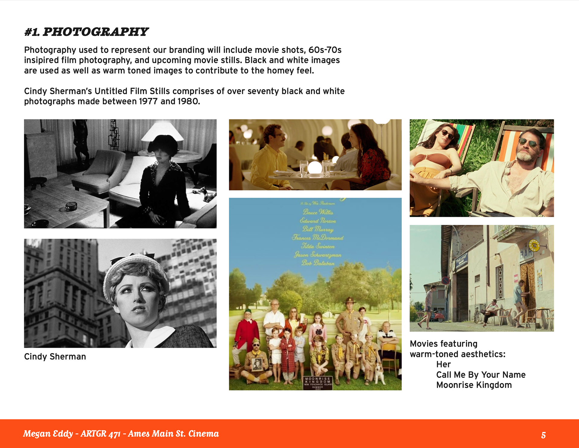
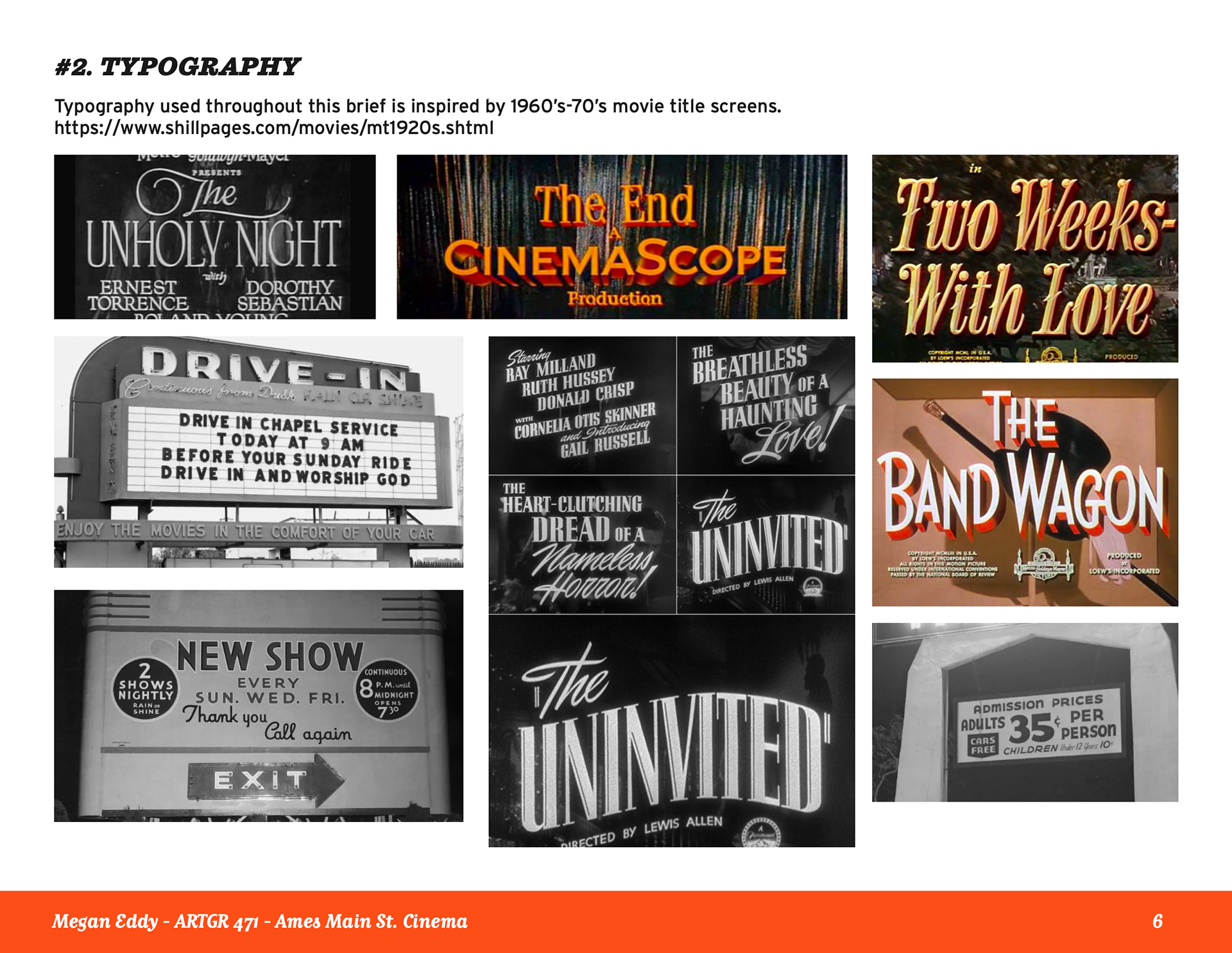
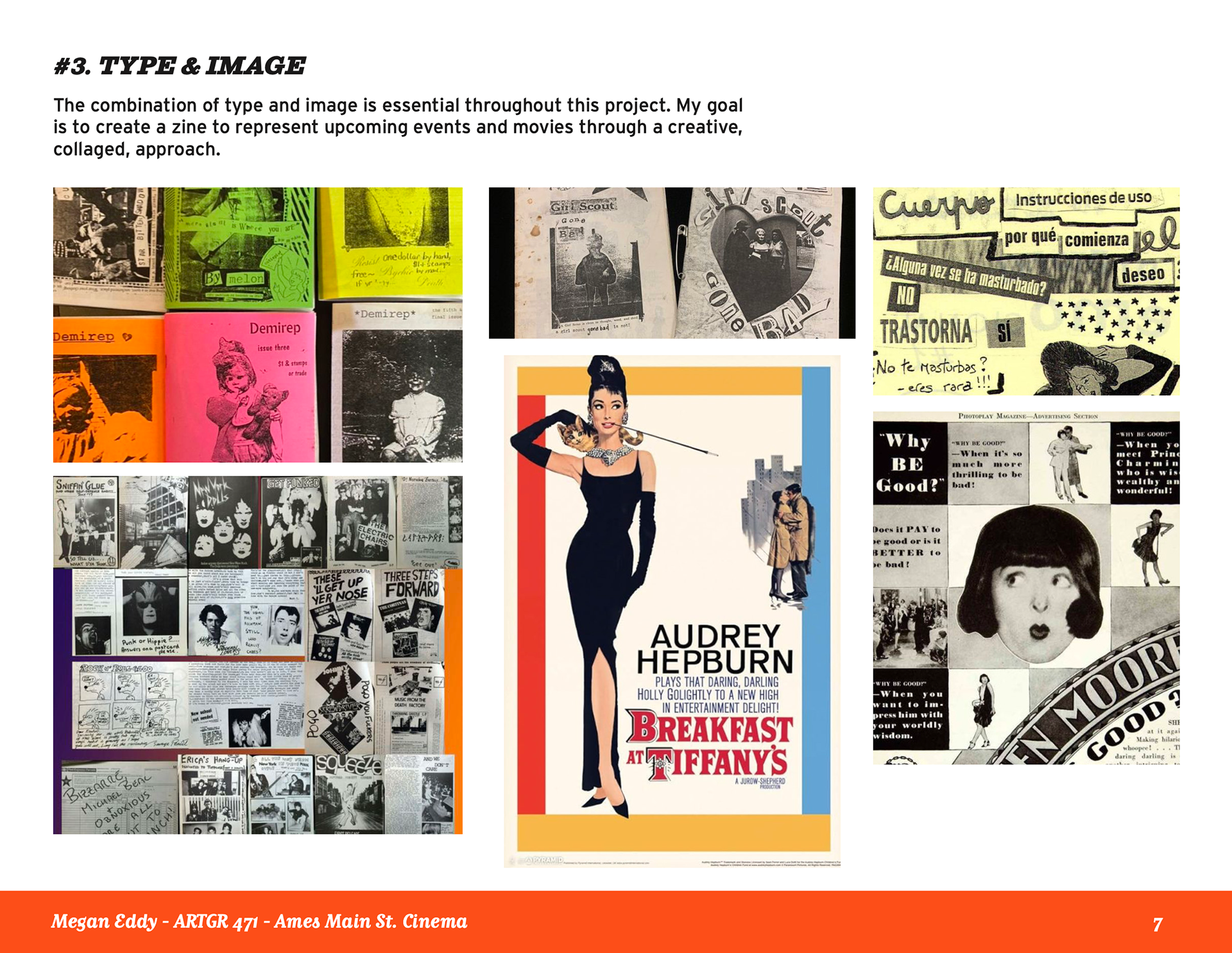
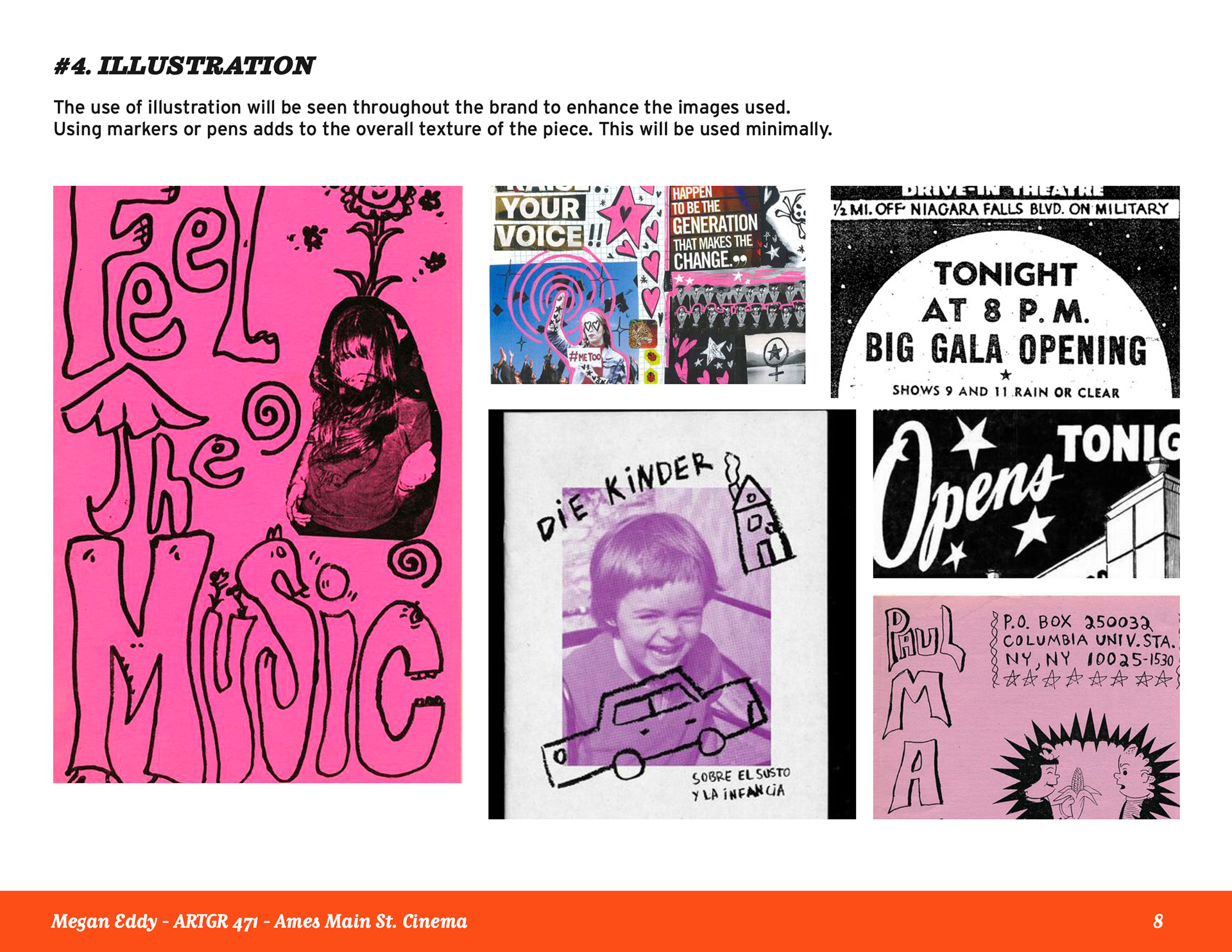
I wanted to create something that would improve the community and encourage involvement while also highlighting students and their work. I began my process by researching existing arthouse cinemas and reviewing their branding and typography usage. Additionally, I researched type and image combinations that catered to my brand's core values.
When beginning the logo design process, I was inspired by 50’s-60’s movie title screens. I played with warping the text as well as using multiple typeface combinations. Ultimately, I experimented with boxes and closed figures to create a dynamic and visually interesting design. I created multiple variations of the logo that can be used as a wordmark or a full graphic to allow more usage of the work.
Brand Identity Guidelines Poster:
Risograph Mini Monthly Zine:
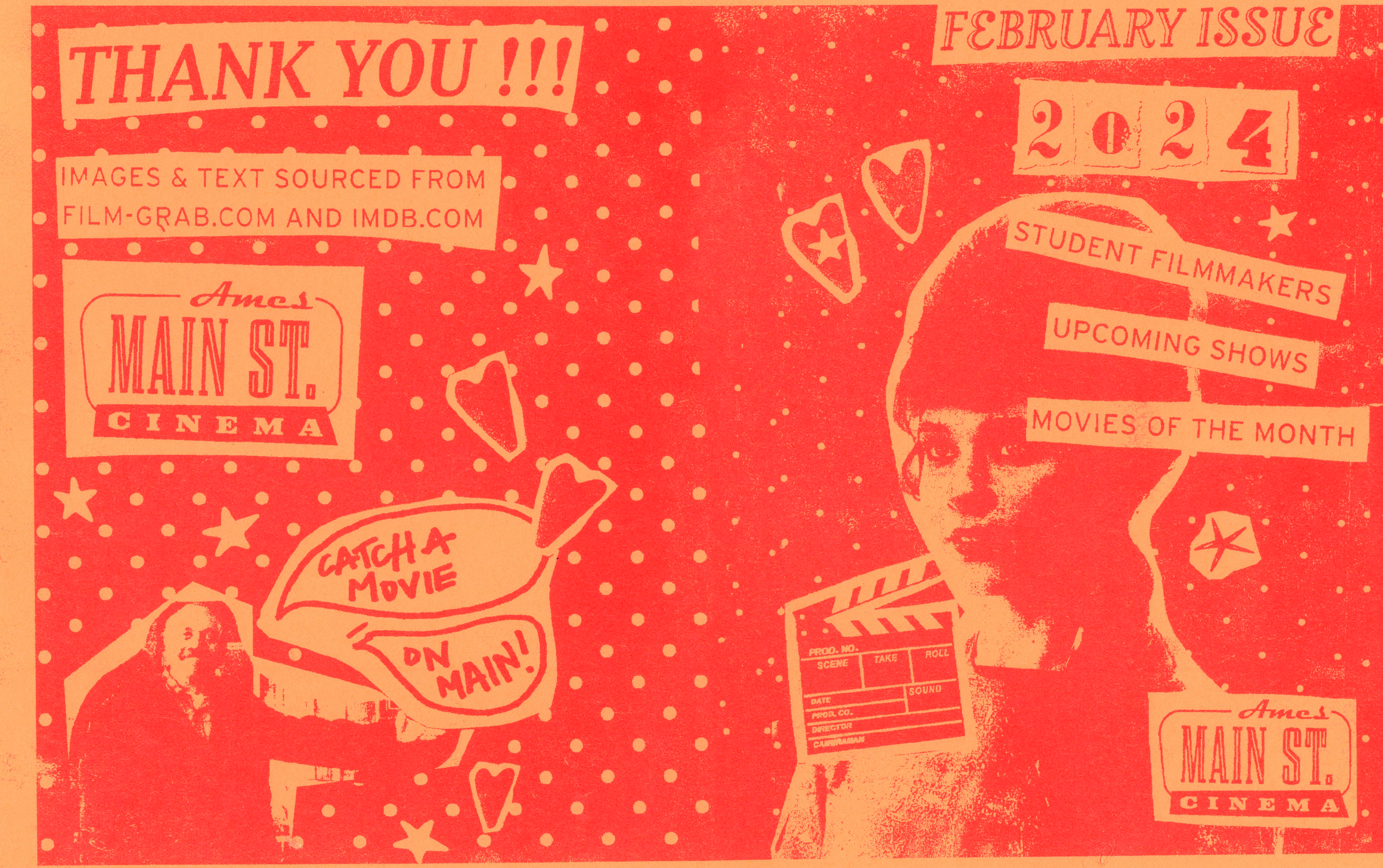
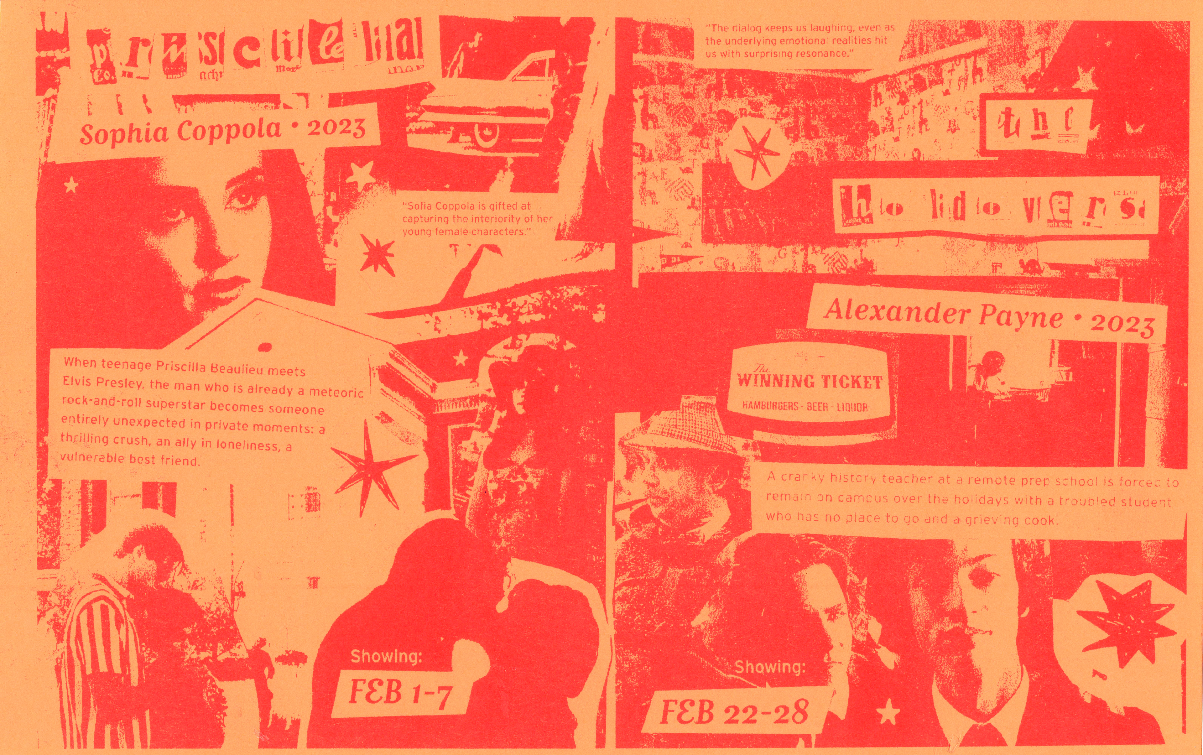

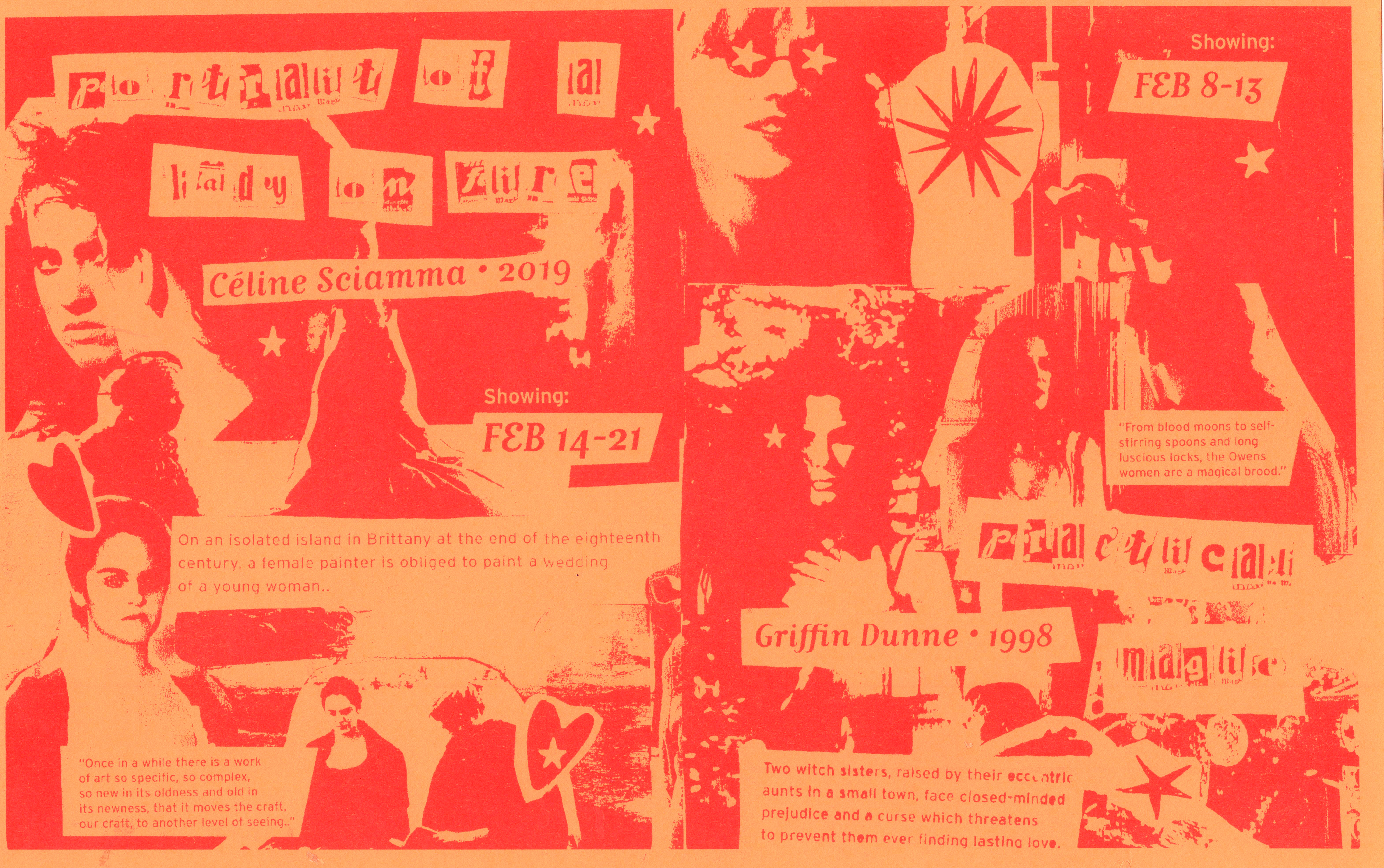
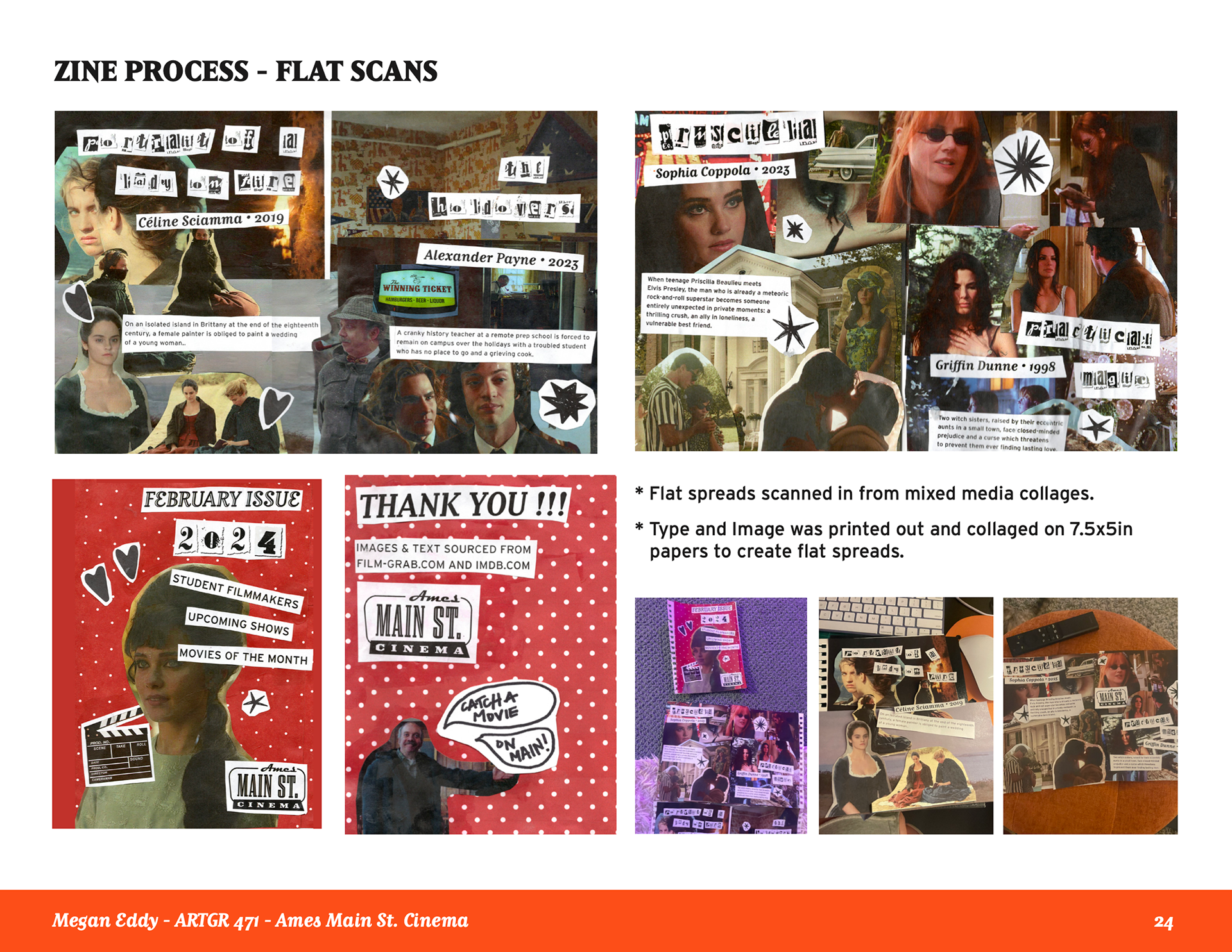
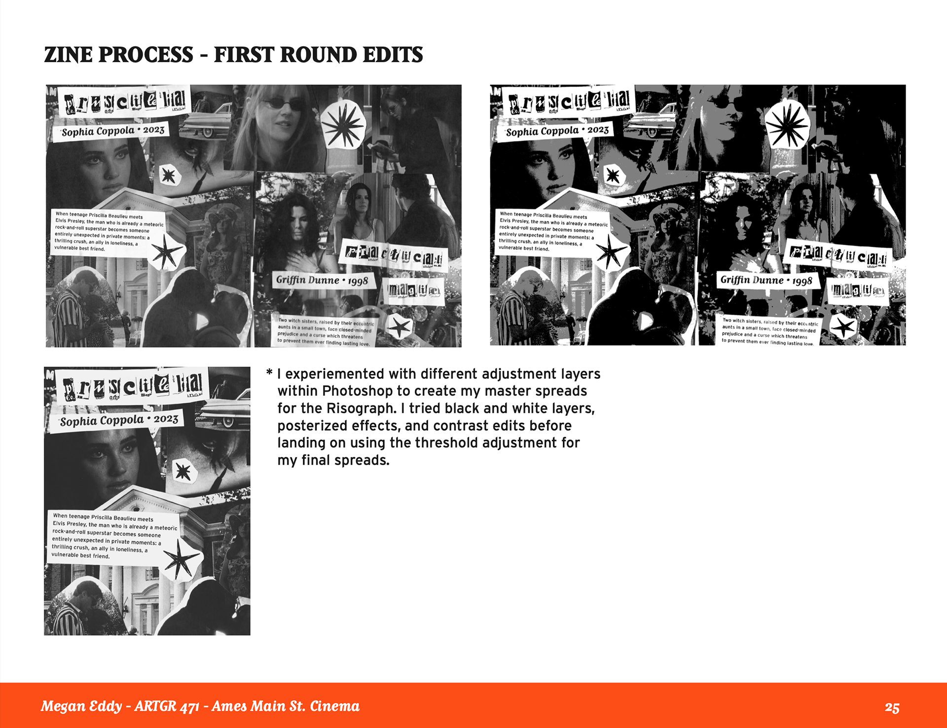
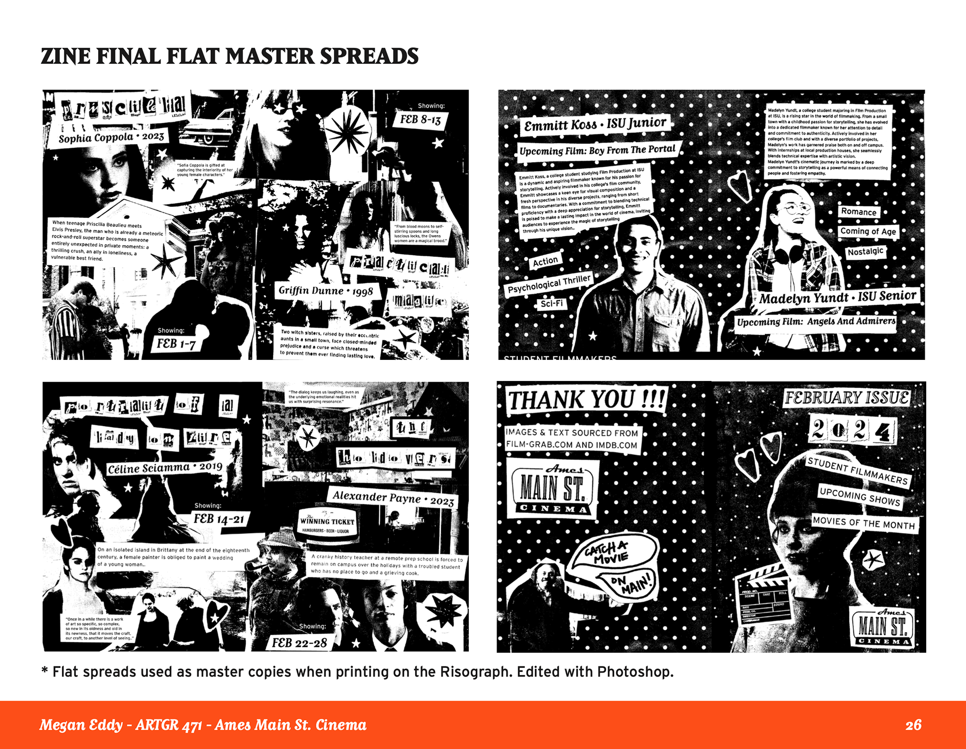
To create my zine, I selected and reviewed various movie stills that I later printed out to create a mixed-media collage. I also produced a type that would be featured throughout the zine. After collaging the elements together, I scanned in the flat stills and edited them using Photoshop and Illustrator. At this stage, I added some additional information to each page as well as edited the effects to create a more distressed, high-contrast appearance. Once I had the final spreads created, I re-printed them in preparation for using the Risograph. I chose to print the final copies of my zine on the Risograph in red ink with orange paper to match my overall brand colors.
Merchandise:
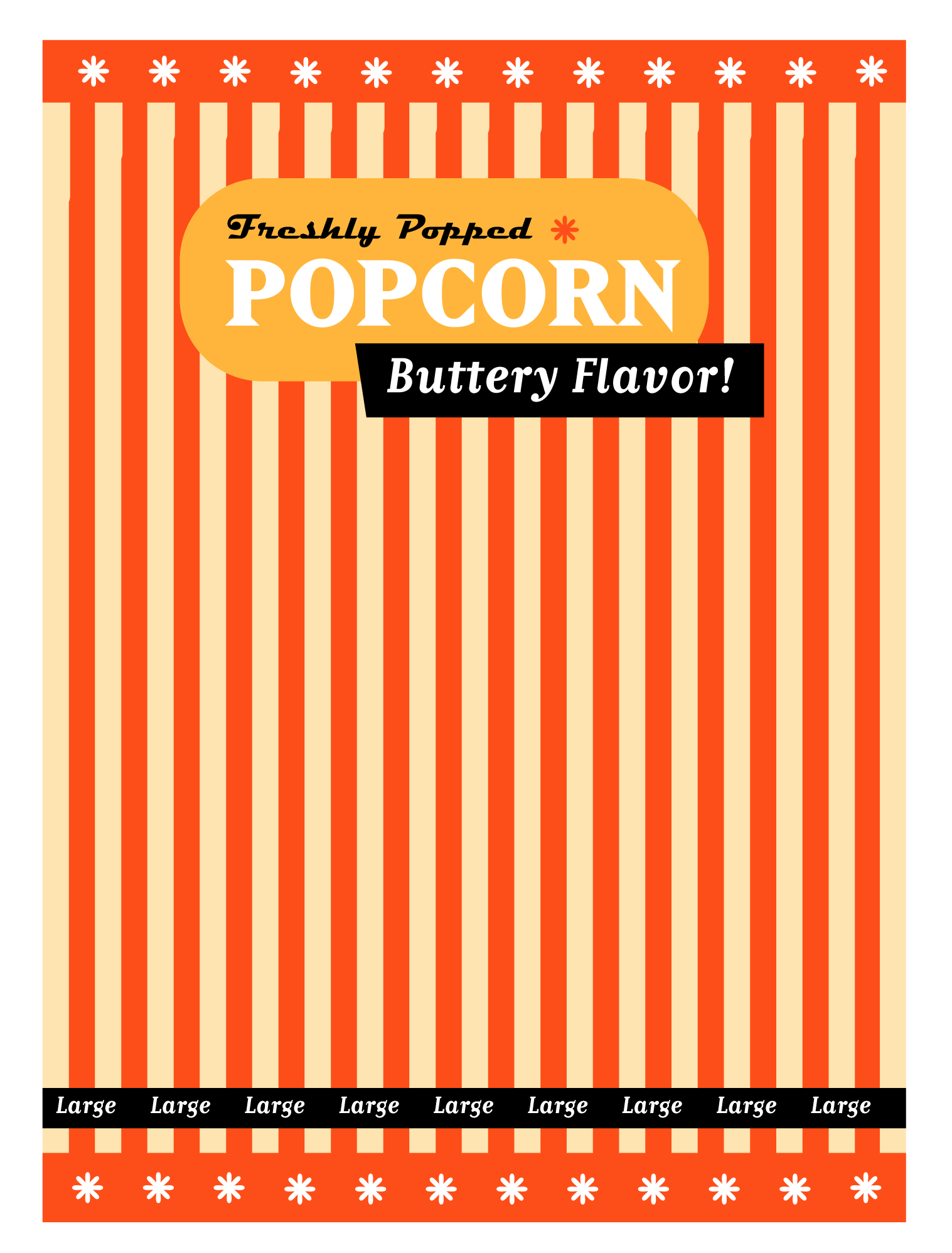
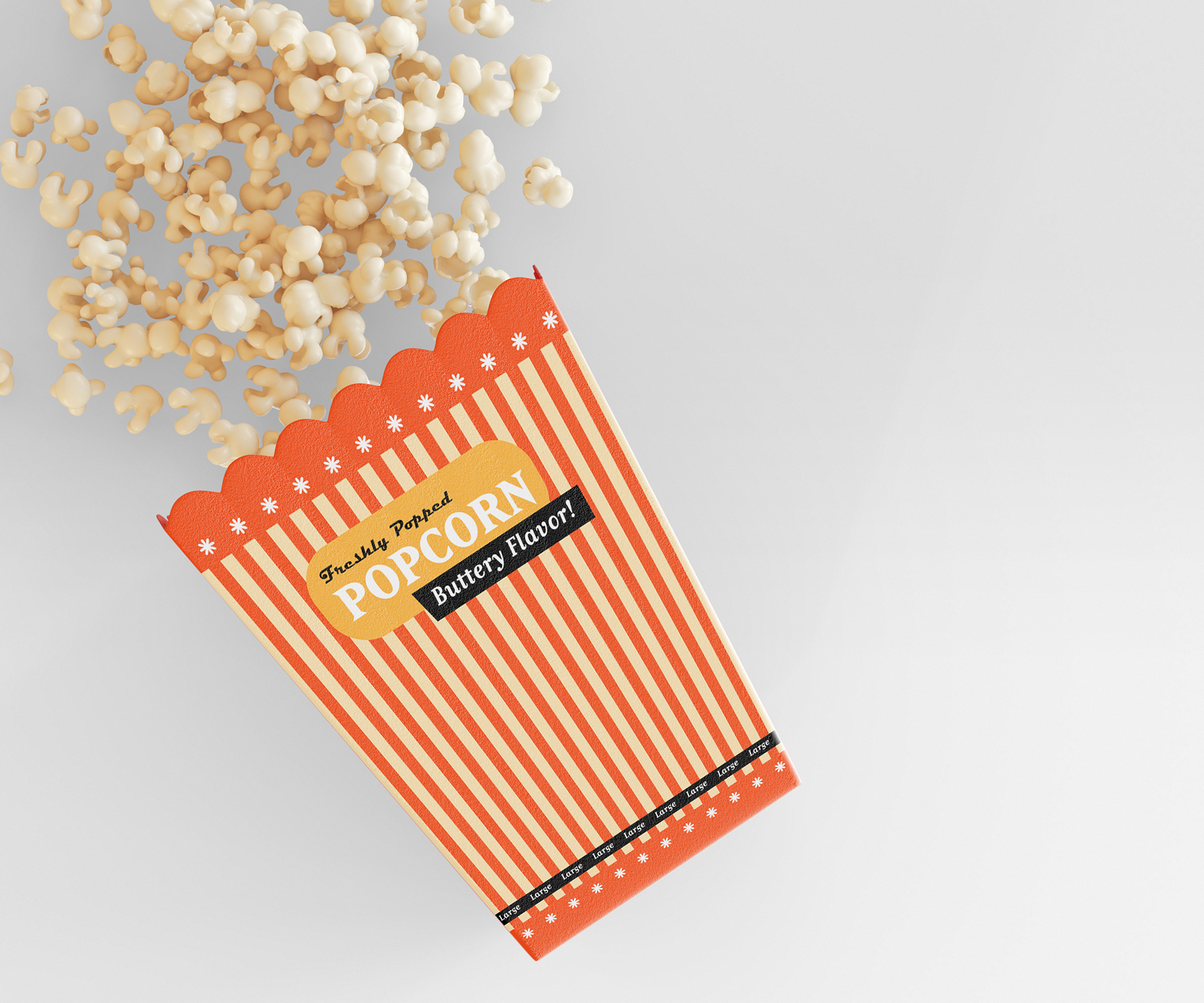
I created a popcorn bucket, t-shirts, and stickers. I utilized the same color palette for overall cohesiveness as well as consistent typography and shape usage. Each element is inspired by the brand's logo and pulls elements from the design into the merchandise. I researched phrases for my stickers as well as what kinds of shapes and sizes people enjoy using in everyday life. Ultimately, I tested a lot of color and font combinations before finalizing my designs, as I still wanted everything to be legible within a similar color palette. Once all of the merchandise was complete, I created mockups for each design to represent a real, believable product.
